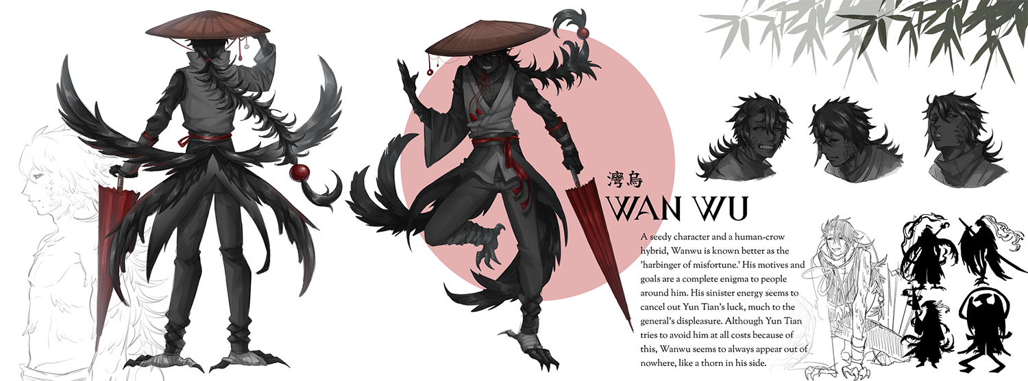
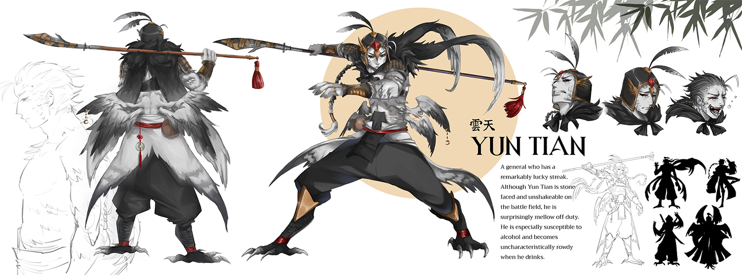
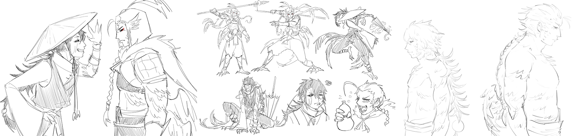
I decided to play into the idea of contrasting between misfortune
and good luck because of China’s culture of auspiciousness. I chose
a crow and red-crowned crane to represent these sides both because
of the dichotomy of their appearances and because of their meaning
in Chinese superstition.
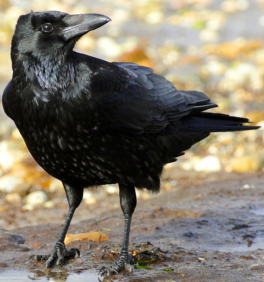
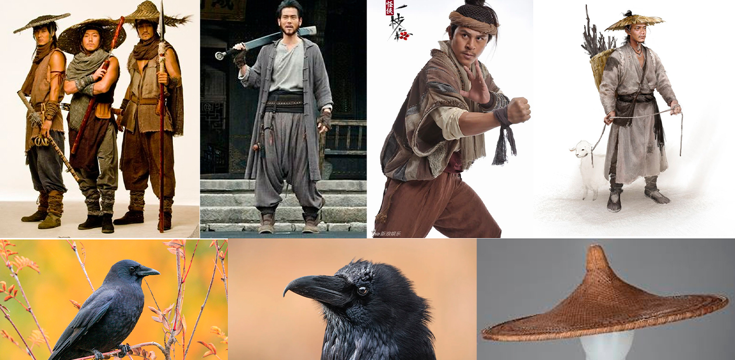
Crows are often associated with bad omens in Chinese culture,
labeled as harbingers of misfortune. At this stage of my research, I
was conceptualizing a former warrior still clinging on to their
pride from the past, or a rogue/bandit character. I researched
clothing average citizens might wear, tattered but appropriate for a
quick getaway or scuffle on the streets. Conical hats are common in
Asian countries to combat the sun, so I wanted to implement it into
this rogue character that would be travelling around.
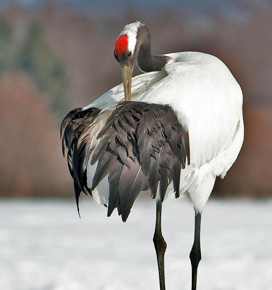
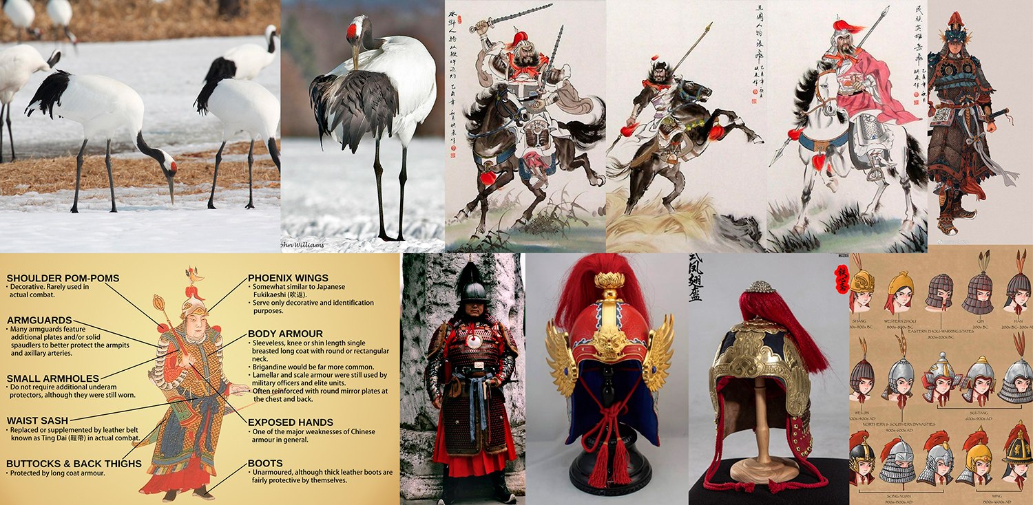
The red-crowned crane is often associated with longevity, wisdom,
peace and harmony in China. With these attributes, I immediately
thought of an honourable and grand warrior. In my research, I found
that the helmets of ancient China are often adorned with bird
feathers at the top — fitting for my theme. Red and gold are both
prominent colours of China, with the red symbolizing good fortune
and gold symbolizing prosperity. I tried to keep these in mind as I
was designing the character.
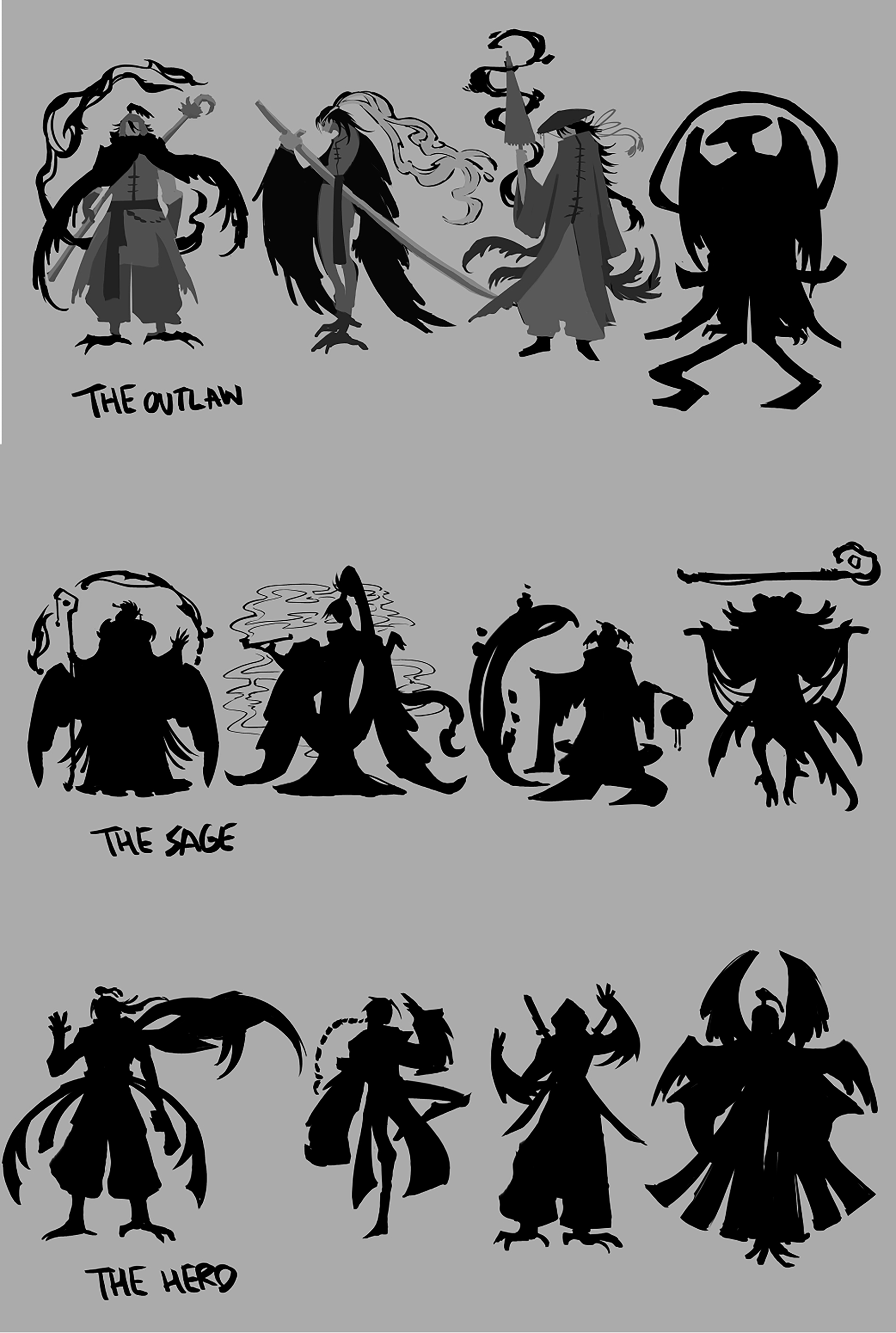
In my thumbnailing and exploration phase, I played around with the
ratio of human to bird, and how wings would translate on a human’s
anatomy. Perhaps it would be attached to the arms, or coming from
their back. I wanted to create an air of mystery into the crow’s
design, so in some of the thumbnails I created a wide conical hat
to hide his face partially. In my thumbnailing of the red-crowned
crane hero, I was exploring different ideas between a grand
warrior decorated heavily, or a more cunning and sleek design.
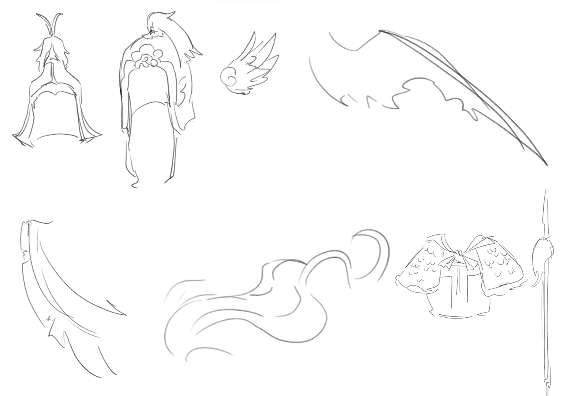
In the conceptual sketch phase, this is where I was figuring out
their personalities and body language. Because outlaws portrayed in
media are always mysterious and stoic, I wanted to break the mold by
making the rogue more mischievous and sly — he is a crow after all!
In turn, to contrast his playfulness, I thought the red-crowned
crane warrior being the more stoic and stern one would create an
interesting dynamic between the two.
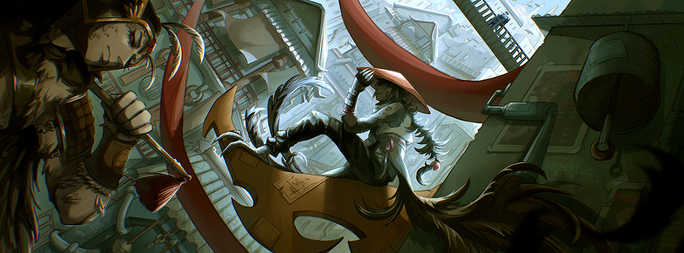
Key Art
Inspiration
My first step was to look at one of my favourite artists,
Felicia Chen,
and her work. I broke down elements of her art and noted down what
made her compositions so successful. In many of her work, contrast and
strong silhouettes were most prevalent. The ratio of her canvas’ are
narrow, allowing for a more cinematic and clear focal point. In each
work, there is a distinct foreground, middle ground, and background in
which the further a subject is, the more faded it is painted.
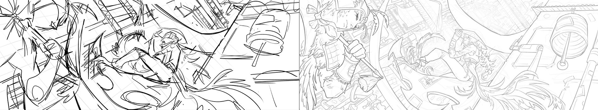
Lineart
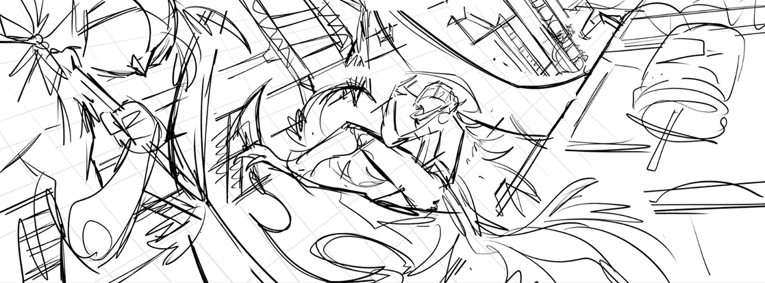
I decided to challenge myself by tackling a challenging angle, using
a rough grid to map out the layouts of the buildings. When I draw
complex angles such as this one, I think of the subjects as cubes to
break down such a daunting task into something more simple.
When I am in the line art stage, I always use heavier lines for the
foreground and lighter ones as it gets further back to ease some
tension off the viewer’s eyes.
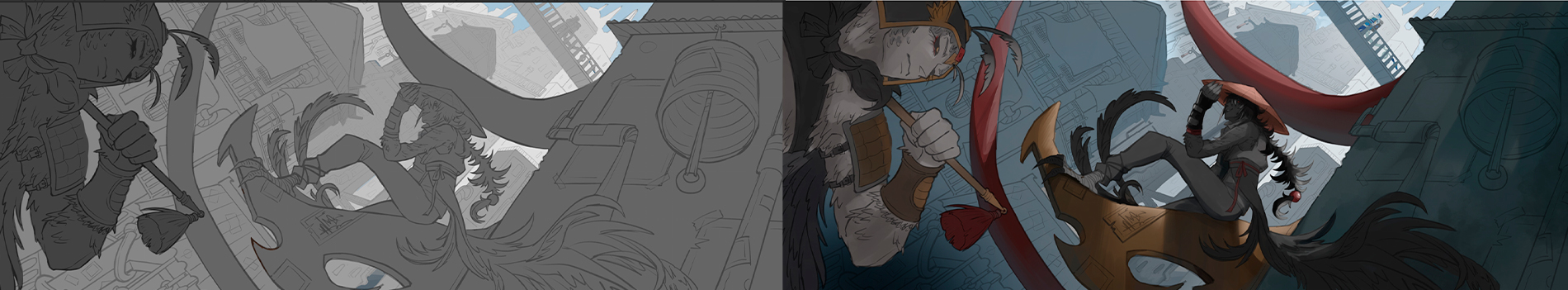
Base Colours
In this stage, I started trying to figure out the hierarchy of the
piece using a darker foreground and transitioning to a lighter
background. I coloured the composition in a grayscale to manage the
layers more easily. I slowly applied base colours using a blue hue as
the base colour.
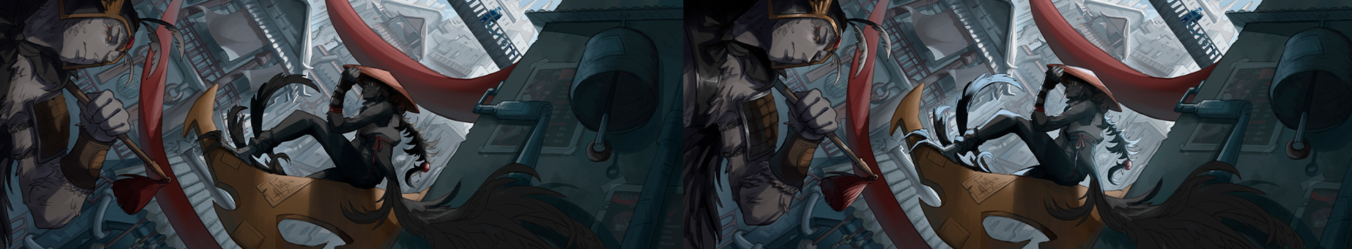
Lighting
Using the multiply layer, I started blocking off shadows and mapping
out the lighting. This was the most difficult step of the process, as
I had to test out how the light from the sky would bounce off every
building and character. I used a strong rim light on the characters to
bring them out even further.